

Resume font size becomes a difficult decision when one more line pushes a document onto another page. Reducing everything seems like a quick fix, but a page that technically fits can become tiring to read. The number in the font menu is only one part of the decision: the typeface, weight, line spacing and amount of text also affect what a reader sees. A useful choice lets someone find your experience and read the evidence without fighting the layout.
This free guide works with an ordinary document editor and PDF viewer; no app, subscription or paid template is required. It is a practical review method, not a universal typographic standard or an applicant-tracking guarantee. Follow any employer instructions first, start with readable body text, then adjust the structure and content around it. The final test belongs to the file you will submit, because an attractive editing view does not prove that an exported document has kept the same layout.
Choose a resume font size baseline before fitting the page
Read the application instructions before changing the design. A required template, file format or page limit takes priority over a generic recommendation. Distinguish an employment resume from an academic CV or a form completed inside a portal; they can have different purposes and constraints. Save a working copy so that a formatting experiment does not overwrite the version you already submitted. You need a clear starting point, not several nearly identical files whose differences you cannot explain.
Try 11 or 12 points for the main text as a starting comparison, not a promise that either size suits every typeface or reader. Harvard's career guidance for PhD students gives a 10–12-point range in its resume advice. That provides context, not a universal minimum or a reason to shrink every document to 10. Check the actual letters and paragraph density in your own file before deciding whether a size is comfortable.
Use a realistic paragraph from your experience section for the comparison. Include a date, a job title, a bullet and a longer line, rather than judging only your name in a large heading. Keep the content and page size unchanged while comparing the two sizes. If you change the font, margins and wording at the same time, you will not know which change improved the result. Record the choice once it works, then apply it consistently.
Compare the letters, not just the point setting
Two typefaces set to the same point size can look noticeably different. Some have taller lowercase letters, wider shapes or more space within each character. Others appear compact or delicate. This is why a document that looks clear at 11 points in one font may feel cramped in another. Select a conventional, readable face available in your editing environment, and inspect ordinary words and numbers rather than assuming that a familiar font name settles the question.
Look at details a recruiter may need to distinguish: dates, qualification names, an email address and similar-looking characters. Thin strokes can be difficult against a light background, while excessive bold makes every sentence compete for attention. Use normal body weight for descriptions and reserve emphasis for useful labels. A restrained design is not a guarantee of successful parsing, but it avoids asking decorative type to do the work that clear organization should do.
Check punctuation, accents and any language-specific characters actually present in your resume. A sample written only in English will not reveal how another alphabet or an accented name appears in the chosen font. Do not replace correct spellings with simpler characters merely to preserve a design. If the font cannot display your real information reliably, choose another supported face and repeat the export check. Accuracy remains more important than keeping the first visual choice.
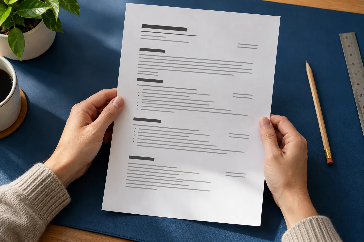
Give headings and contact details different jobs
A useful hierarchy makes the document navigable without turning it into a poster. Your name can be larger than the body; section headings need enough distinction to identify experience, education and skills. They do not all need a dramatic size increase. A modest difference combined with consistent weight and spacing may be sufficient. Keep equivalent headings equivalent, so the reader does not mistake a visually prominent minor section for the most important evidence.
Do not make contact details so small that the reader has to zoom in to use them. A decorative header can consume more space than the experience you are trying to preserve. Reduce unnecessary header height before reducing every body paragraph. Check whether a long email address or portfolio link wraps cleanly, and use meaningful visible text when a link is included. Important information should not depend on recognizing a tiny icon without a label.
Set these choices through styles where your editor supports them. One body style and a small set of heading styles are easier to maintain than individually adjusted paragraphs. If you are choosing between layouts, the resume format guide helps separate structure from decoration. Select the structure that gives your relevant experience a clear order, then apply the same typographic rules throughout rather than giving each section a separate design.

Use spacing to separate ideas without wasting the page
Readable type can still feel dense when lines and paragraphs are packed together. Inspect the space between lines within a bullet, between separate bullets and before a new section. These spaces have different jobs: they keep a sentence together while showing where another idea begins. Avoid adding blank paragraphs repeatedly to position content; those manual gaps can move unpredictably when text changes. Use the editor's paragraph and spacing controls when available.
There is no single line-spacing value that repairs every resume. Compare the actual result: can you follow a two-line description without jumping into the next bullet? Is a section heading visibly attached to the content below it? Does one short role receive an enormous empty gap while a more important role is compressed? Adjust related spacing consistently rather than tightening only the section that happens to fall at the bottom of a page.
Margins also affect the reading experience. A narrow margin may gain a few characters per line while making the page feel crowded, and very long lines can be harder to follow. Do not solve one overflowing word by stripping away every edge. Review body width together with font size and line spacing. The aim is not the greatest possible number of characters on a sheet; it is a clear account of the experience relevant to this application.
Cut lower-value content before shrinking every sentence
When the page is too long, inspect what is taking up space before touching the font menu again. Repeated responsibilities, generic claims and old details unrelated to the vacancy often deserve editing first. Compare each bullet with the requirements you actually need to demonstrate. Keep truthful scope and useful evidence, but remove duplicated introductions such as responsible for when a direct description is clearer. Shorter wording should preserve meaning rather than replace it with unexplained abbreviations.
For a fictional example, a candidate has two bullets describing the same weekly scheduling task. Combining the repeated context may create room without losing the task, its audience or the candidate's contribution. By contrast, deleting the project context from the only relevant example could make the resume shorter but less informative. Choose cuts by information value, not simply by which line is easiest to remove. Never invent a metric to make a compressed statement seem more convincing.
Do not assume that every resume must occupy exactly one page. Follow explicit limits and consider the purpose and amount of relevant experience. The one-page or two-page resume discussion addresses that separate decision. If there is no strict limit, a readable additional page may be preferable to a single crowded sheet. Check page breaks deliberately instead of letting one orphaned line decide the entire document's typography.
Check page endings and consistency after each change
Changing body size can alter line wraps throughout the file. Look for headings left at a page bottom, dates separated from their roles and bullets split in distracting places. Where the editor offers paragraph controls, keep a heading with the following paragraph instead of inserting a stack of empty lines. Do not conceal an awkward break by making just one paragraph smaller. That creates an inconsistent result and becomes difficult to maintain during the next revision.
Review a second page as a continuation of the same document. Its headings, body size, date formatting and margins should follow the same rules as the first page. A brief final page may signal that the structure needs another look, but it is not automatically proof that everything must be compressed. Consider whether a section belongs together, whether a repeated header is too large and whether an earlier content cut is genuinely justified.
Inspect the document after the last wording edit, not only after the main formatting pass. A corrected qualification name or an additional date can create a new wrap. Make a short list of the actual style choices you settled on: font, body size, headings and spacing. This is a maintenance note for your own use, not another attachment to send. It helps you revise the next application without rebuilding the design from memory.
Read the exported file at a realistic scale
Export in the format the employer accepts, then open that file independently of the editor. Compare its page count, headings, line breaks and special characters with the source. A PDF can look different if a font was substituted or an export setting changed the layout. Do not inspect only the first page or a thumbnail. Read the experience text and contact details in the actual exported version before treating the formatting as finished.
Zoom is a viewing control, not a font-size change. A full-page view on a small laptop can make perfectly ordinary type appear tiny, while a large zoom can hide an overcrowded layout. Use more than one view: the whole page for structure and a comfortable reading view for text. If you print a check copy, inspect the print scale and paper size. A fit-to-page setting may change the physical size of the printed text.
Try selecting and copying a short passage from the exported file to see whether the text remains usable. Check the pasted order and characters, but do not treat this simple test as proof of formal accessibility or compatibility with every recruiting system. If the employer requests an editable document, inspect that version too. A good PDF preview does not validate a different file format, and a screenshot of a resume is not equivalent to a checked text document.

Keep the version whose readability you actually checked
If possible, ask another person to locate your latest role, a relevant qualification and your contact details without a verbal explanation. Their difficulty finding something can reveal a hierarchy problem that familiarity hides from you. This is an informal usability check, not a representative study or a prediction of hiring decisions. Listen for concrete observations such as the dates are hard to read rather than changing the document to satisfy every personal style preference.
Once you have checked the final file, give it an identifiable name and retain it with the relevant application. The resume filename check explains why a clear filename still needs a content check. Verify the attachment itself before sending or uploading, especially if an earlier compact version remains nearby. A carefully reviewed export does not help if the portal receives another draft. Inspect any available upload preview without assuming it is identical to your local viewer.
Your final decision should be explainable: readable body text, a modest and consistent heading hierarchy, useful spacing, relevant content and an export you inspected. There is no need to chase a supposedly perfect point number or keep reducing the type until every detail fits. The free method is complete when the submitted document presents your real evidence clearly within the actual instructions. Keep that file, and revisit the content rather than automatically shrinking the font for the next vacancy.